Performance Report: 1/31/2024
All performance data for our strategies is net of all fees and expenses. All performance data for indexes or other securities is from sources we believe to be reliable. All data is as of 1/31/2024.
Investment Strategy
MAP: Full ($500k+)
MAP: Mini
MAP: ETP (<150k)
S&P 500 Index2
Balanced (AOM)2
Global Balanced2
Jan. Return
(2.4%)
(3.4%)
(2.4%)
1.6%
1.1%
0.7%
2023
9.5%
3.1%
1.6%
24.2%
8.9%
12.3%
Inception1
37.9%
26.4%
22.5%
64.5%
17.9%
30.8%
VORR3
.794
.533
.452
.623
.339
.364
January was a lousy month for us as all my managed strategies gave back some gains while the S&P 500 continued to grind higher. Despite the setback this month, my Full-size strategy (>$500k) has done incredibly well over the past couple of years. It is up nicely since the stock market peaked in Jan of 2022 and our risk-adjusted returns are still enviable, but we've experienced mild losses the past couple of months while the "everything bubble" has continued.
It’s a different story with my MINI and ETP strategies as their performance has just not measured up to my expectations for you (The equity portion of all three is identical, the only difference is commodity exposure). I'm working day and night to remedy the situation. And once the entire commodity space breaks free from the FED's grip, our gains will be impressive. But until then, I'm not sure how we'll do.
My Full-size accounts have done well by retaining a large allocation to orange juice along with rice and sugar, all of which did well in 2023. At some point, all commodities will follow suit and all my strategies should perform inline with my Full-size strategy.
About six months ago, I removed any positions that I deemed to be cyclical or economically sensitive. In our industry, we would describe them as "high beta" securities meaning they are strongly correlated with the S&P 500. This move served us well from Aug. through Oct. but we have missed the significant rally in the S&P 500 over the past three months. Further, the FED has continued to put additional downward pressure on commodities, of which, we have held a varying but significant allocation. This development has resulted in losses the past few months but, it plays perfectly into my long-term thesis. The fact the FED is "doubling down" on their scheme to combat inflation in the commodity markets has been short-term destructive but will lead to even bigger gains down the road.
The FED's scheme to contain inflation by shorting commodity futures will eventually backfire. Every time they have tried something similar in the past, it has always failed in due time. And when it does, we'll earn considerable profits. Unfortunately, I do not know when "in due time" will take place.
Equity Market Outlook
The following will succinctly outline why I continue to stay clear of cyclical stocks that are highly correlated with the S&P 500. I’ll begin by forwarding an abbreviated analysis from Dr. John Hussman titled, “Cluster of Woes”:
Based on dozens of measures that include valuations, internals, overextension syndromes, and numerous technical, fundamental, and cyclical gauges we’ve developed over time, we estimate that current market conditions now “cluster” among the worst 0.1% instances in history – more similar to major market peaks and dissimilar to major market lows than 99.9% of all post-war periods. (emphasis mine)
I call this the “Cluster of Woe” because the handful of similarly extreme instances (most notably in 1972, 1987, 1998, 2000, 2018, 2020, and 2022) were typically followed by abrupt market losses of 10% to as much as 30% over the next 6-10 weeks (average -12.5%), with losses at the smaller end of that range often seeing deeper follow-through later. Still, I treat these outcomes as “regularities” rather than “forecasts,” and my impression is that investors don’t accept those regularities anyway.
Our most reliable valuation measures are again beyond every extreme in U.S. history prior to March 2021, apart from 5 weeks surrounding the 1929 market peak. Meanwhile, our most reliable gauge of market internals remains unfavorable as the result of persistent divergences across individual securities and sectors. Yet even though the market has lagged Treasury bills for more than two years, my impression is that investors feel an almost excruciating “fear of missing out” amid nominal record highs in the S&P 500 and Nasdaq 100, enthusiasm about an economic “soft landing,” and an expected “pivot” to lower interest rates.
Abandoning systematic investment discipline amid the most extreme market conditions in history would be a costly way to buy a fleeting sigh of relief.
To read Dr. Hussman’s entire piece, click here.
I’ve quoted Hussman repeatedly in past updates typically with an asterisk attached, in that, he is a die-hard perma-bear. I can’t recall a bullish commentary made by him over the past decade which means following his advice would have led to inferior returns. But I do believe his analysis has substantial merit, using it as a lens to view the capital markets more objectively than the perma-bull bologna spewed out by the financial media.
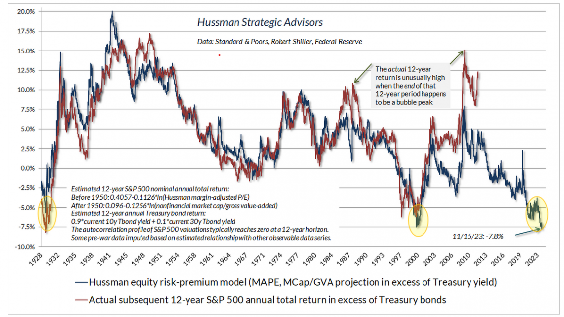
To arrive at his most recent conclusions about the stock market, Dr. Hussman uses two sets of data. The first is a long-term proprietary model based on various metrics. Historically, his model has done a pretty remarkable job of estimating the direction of future returns. Here is an updated chart of his long-term model that shows that stock market returns over the next 12 years should underperform higher-yielding US Treasuries by a substantial margin.

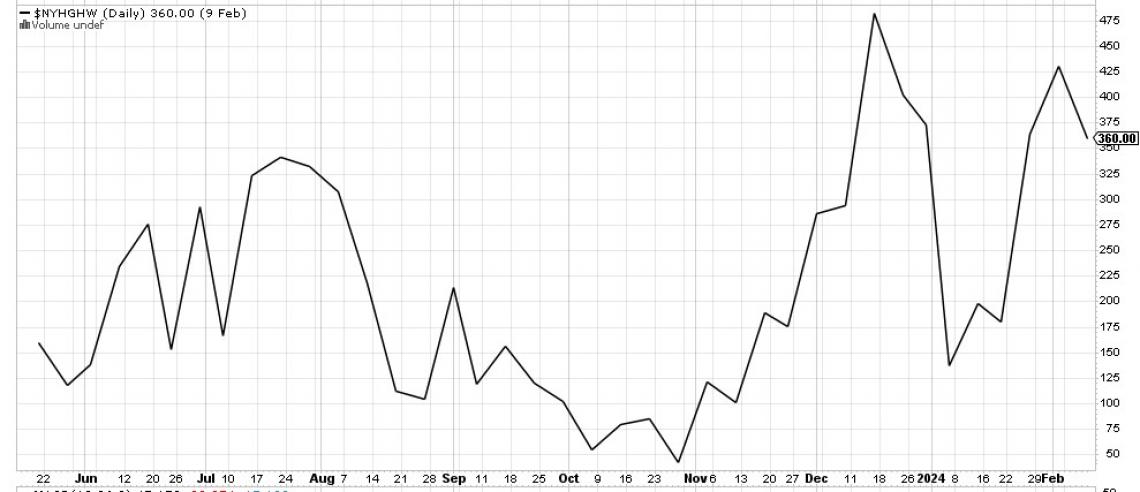
Beyond the long-term, big-picture proprietary model he developed, he also uses some short-term indicators to measure how the stock market may do in the near-term. And these indicators are largely the same as the ones I’ve used for the past two and half decades. Things like market leadership, breadth, ect. The following is a chart of new 52-week highs on the New York Stock Exchange (NYSE).

While Dr. Hussman has been sounding the alarm about the dire long-term prognosis for the S&P 500, he is just now addressing the short-term indicators that align with his long-term pessimism. Now I believe his analysis is due more attention.
While the S&P 500 continues to set new records, fewer stocks are setting new records, which is a textbook example of a lack of leadership. The variance between the 52-week high figure in December and the current value is stark given how well the S&P 500 has performed in January. This lack of leadership has historically preceded every single bear market in history.
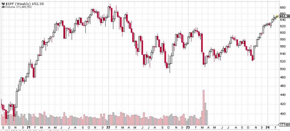
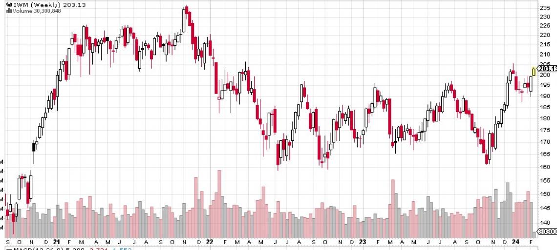
Closely associated with leadership is breadth and the stock market is seeing bearish divergences there as well. The “equal-weighted S&P 500” has failed to best its 2021 highs despite the “cap-weighted S&P 500” doing so. Further, several key indexes are significantly below their all-time highs, most notably, financials ($SPF) and small-caps (IWM). Below are weekly charts of both indexes which illustrate both how these critically important sectors are still below their all-time highs set in late 2021.


Moving Forward
As mentioned earlier, right now I am favoring physical commodities rather than over-valued paper equities. If the time-tested doctrine of “buy low, sell high” is still valid, then my approach should prove to be prudent.
Just as there are bearish divergences in the equity markets, there are bullish divergences in commodities. First, there are the extreme divergences between small, thinly-traded contracts versus large, liquid commodities. Thinly-traded commodities are nearly impossible to be shorted by speculators, whereas, large commodity markets can easily be shorted by speculators. This matters because it provides solid proof of my thesis. While the commodities Wall Street and the FED cannot short are hitting all-time highs and the commodities they can short are at or near 52-week lows, it provides emphatic evidence that they are shorting the large commodity markets.
Small, thinly-traded commodities like cocoa, coffee, cattle, rice, and orange juice are all trading at or near all-time highs. Versus large, liquid markets like corn, soybeans, and energy which are trading at or near 52-week lows.
Just to give you an idea of what I mean by “small and thin” versus “large and liquid”, the May OJ contract I just sold for my full-size contracts trades on average 200 contracts a day. Whereas, the May crude oil contract trades 7500 contracts a day. So, on any given day, about $10M in May OJ is changing hands whereas $557M of May crude oil is changing hands. Further, the full-size oil contract actively trades 12 monthly durations while OJ only actively trades 3 or 4 monthly durations. Add to this that crude oil has both actively traded mini and micro contracts whereas OJ has neither. Thus, the market for crude oil is at least 10x, more likely 15 - 20x, the size of OJ.
CNBC reports that “weather” is causing prices to go up for cocoa, cotton, live cattle, and orange juice. And they report that export bans in India are causing the price of rise to rise. How could the weather be so terrible for cocoa, cotton, live cattle, and orange juice but so ideal for corn, soybeans, and sugar? If India restricts exports of rice, could not Brazil ban the exports of soybeans or sugar? What if Vietnam or Columbia puts price controls on coffee? What if Ukraine can't get wheat out of the Black Sea?
There are hundreds of these scenarios and the capital markets are seemingly ignoring them all. Or is something else at work? The fact commodities have traded in contango for an extended period has been proof enough for me that large speculative shorts and driving market trends. The remarkable divergences in prices between small, thinly-traded contracts and large, liquid contracts is further proof “something is rotten in Denmark.”
The $1M question is not if, but when will the physical market break the paper market for real assets? I can’t be certain it will be sooner rather than later but certain precursors that are in place right now. While there are unprecedented divergences in the small and large markets, there are a growing number of divergences in highly correlated commodities that classify as “large and liquid”. Wheat is outperforming the other grains, notably corn and soybeans. Unleaded gas has closed at a new six-month high while crude oil continues to languish in a trading range not too far from its 52-week low. Unleaded gas led crude oil lower and now it seems it is leading the energy sector higher. The two practically move in lock step and for good reason. To see one break out of resistance could be bullish for the other.
These short-term divergences may be the “canary in the coal mine” that the physical market is about to break free from the paper market. I would want to see crude oil rise above its recent trading range before turning bullish on the energy space. And I would want to see wheat break out and close at a multi-week high before becoming too bullish on the ag space. If these price moves develop then I’ll increase our exposure to the real asset space.
Lastly, I’ll touch on precious metals. Throughout my entire investing career spanning four decades, silver has led gold both higher and lower. When silver underperformed, both would fall in value. When silver outperformed, both appreciated. I cannot recall an exception to this relationship. Today, silver and gold are exhibiting a strong bullish divergence as silver is outperforming gold by a significant margin. The dispersion is so strong I wouldn’t be surprised if there is some short-term weakness but I expect both to be much higher by the end of the year.
There are two critical levels for silver that I’m watching. If silver closes above its January highs at $23.5, it would confirm the divergence and both metals could be off to the races. The next ban of resistance is above $26. If this level is breached and silver holds above it, it would be confirmation of an incredibly bullish pattern that has been in place for over 12 years. After $26, the next level of resistance for the metal is $50, over 100% higher than where it trades today.
Conclusion
I am fond of saying, “’buy low, sell high’ is the little black dress of investing – it never goes out of style.” Wear it out to happy hour on a Friday evening, wear it to church on Sunday morning. Wear it to a funeral, wear it to a wedding. Wear it to a formal Ball, or wear it to the ballgame. The little black dress serves just about every purpose.
Today, the valuation of the S&P 500 is at an all-time high. Just to reiterate Dr. Hussman’s analysis, the current market environment is identical to the 0.1% of worst times to be invested. Currently, I see broad-based equity markets to be a terrible investment as market participants are ignoring obvious potential risks. At the same time, I see a handful of incredibly cheap commodity contracts. Further, there are a handful of reasonably priced equities, mostly linked to the commodity space, that are exhibiting little to no positive correlation with the S&P 500. If I’m right on commodities, then these commodity-based equities could do very well.
The choice between absurdly expensive large-cap equities and incredibly cheap commodities doesn’t seem like a terribly difficult decision at this time. Could equity markets continue higher while commodities continue lower...absolutely. I suspect they will, I highly doubt the moment I upload this page to my website, both markets will immediately turn on a dime. But five years from now, I believe we’ll all look back at this period and be very grateful for a prudent, “buy low, sell high” approach.
As always, please do not hesitate to call me at 512-553-5151 if I can be of assistance.
Best,
Matt McCracken
1) Inception date of 4/30/2019
2) All benchmark prices are obtained through the Yahoo!Finance website. S&P 500 Index is calculated using the index price. AOM is the iShares Core Moderate Allocation ETF. Global Balanced is calculated using a 40% allocation to the S&P 500, a 40% allocation to BND, and a 20% allocation to IEFA.
3) VORR is our "Value over Risk Ratio": Calculated by taking the total return divided by the sum total of all negative months. Ideally, the ratio represents how much loss an investor has to endure to get X gain. A negative RORR score implies there is more risk in the investment than return.
